
搜索到
226
篇与
» 技术教程
的结果
-
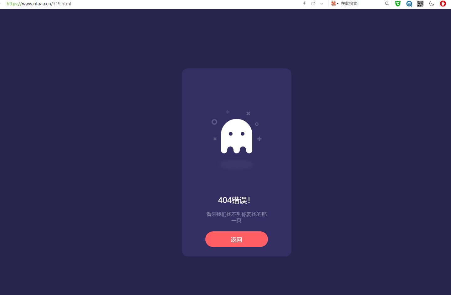
 幽灵404页面代码 跟随鼠标动画 介绍在某站看到的,感觉还不错,就扒来了。幽灵会有浮动动画,跟随鼠标动画。截图代码如下<!doctype html> <html> <head> <meta charset="utf-8"> <title>幽灵404页面</title> <script type="text/javascript" src="https://a-oss.zmki.cn/2020/20200101-cc0f0c1509531.js"></script> <style> html, body { background: #28254C; font-family: 'Ubuntu'; } * { box-sizing: border-box; } .box { width: 350px; height: 100%; max-height: 600px; min-height: 450px; background: #332F63; border-radius: 20px; position: absolute; left: 50%; top: 50%; transform: translate(-50%, -50%); padding: 30px 50px; } .box .box__ghost { padding: 15px 25px 25px; position: absolute; left: 50%; top: 30%; transform: translate(-50%, -30%); } .box .box__ghost .symbol:nth-child(1) { opacity: .2; animation: shine 4s ease-in-out 3s infinite; } .box .box__ghost .symbol:nth-child(1):before, .box .box__ghost .symbol:nth-child(1):after { content: ''; width: 12px; height: 4px; background: #fff; position: absolute; border-radius: 5px; bottom: 65px; left: 0; } .box .box__ghost .symbol:nth-child(1):before { transform: rotate(45deg); } .box .box__ghost .symbol:nth-child(1):after { transform: rotate(-45deg); } .box .box__ghost .symbol:nth-child(2) { position: absolute; left: -5px; top: 30px; height: 18px; width: 18px; border: 4px solid; border-radius: 50%; border-color: #fff; opacity: .2; animation: shine 4s ease-in-out 1.3s infinite; } .box .box__ghost .symbol:nth-child(3) { opacity: .2; animation: shine 3s ease-in-out .5s infinite; } .box .box__ghost .symbol:nth-child(3):before, .box .box__ghost .symbol:nth-child(3):after { content: ''; width: 12px; height: 4px; background: #fff; position: absolute; border-radius: 5px; top: 5px; left: 40px; } .box .box__ghost .symbol:nth-child(3):before { transform: rotate(90deg); } .box .box__ghost .symbol:nth-child(3):after { transform: rotate(180deg); } .box .box__ghost .symbol:nth-child(4) { opacity: .2; animation: shine 6s ease-in-out 1.6s infinite; } .box .box__ghost .symbol:nth-child(4):before, .box .box__ghost .symbol:nth-child(4):after { content: ''; width: 15px; height: 4px; background: #fff; position: absolute; border-radius: 5px; top: 10px; right: 30px; } .box .box__ghost .symbol:nth-child(4):before { transform: rotate(45deg); } .box .box__ghost .symbol:nth-child(4):after { transform: rotate(-45deg); } .box .box__ghost .symbol:nth-child(5) { position: absolute; right: 5px; top: 40px; height: 12px; width: 12px; border: 3px solid; border-radius: 50%; border-color: #fff; opacity: .2; animation: shine 1.7s ease-in-out 7s infinite; } .box .box__ghost .symbol:nth-child(6) { opacity: .2; animation: shine 2s ease-in-out 6s infinite; } .box .box__ghost .symbol:nth-child(6):before, .box .box__ghost .symbol:nth-child(6):after { content: ''; width: 15px; height: 4px; background: #fff; position: absolute; border-radius: 5px; bottom: 65px; right: -5px; } .box .box__ghost .symbol:nth-child(6):before { transform: rotate(90deg); } .box .box__ghost .symbol:nth-child(6):after { transform: rotate(180deg); } .box .box__ghost .box__ghost-container { background: #fff; width: 100px; height: 100px; border-radius: 100px 100px 0 0; position: relative; margin: 0 auto; animation: upndown 3s ease-in-out infinite; } .box .box__ghost .box__ghost-container .box__ghost-eyes { position: absolute; left: 50%; top: 45%; height: 12px; width: 70px; } .box .box__ghost .box__ghost-container .box__ghost-eyes .box__eye-left { width: 12px; height: 12px; background: #332F63; border-radius: 50%; margin: 0 10px; position: absolute; left: 0; } .box .box__ghost .box__ghost-container .box__ghost-eyes .box__eye-right { width: 12px; height: 12px; background: #332F63; border-radius: 50%; margin: 0 10px; position: absolute; right: 0; } .box .box__ghost .box__ghost-container .box__ghost-bottom { display: flex; position: absolute; top: 100%; left: 0; right: 0; } .box .box__ghost .box__ghost-container .box__ghost-bottom div { flex-grow: 1; position: relative; top: -10px; height: 20px; border-radius: 100%; background-color: #fff; } .box .box__ghost .box__ghost-container .box__ghost-bottom div:nth-child(2n) { top: -12px; margin: 0 -0px; border-top: 15px solid #332F63; background: transparent; } .box .box__ghost .box__ghost-shadow { height: 20px; box-shadow: 0 50px 15px 5px #3B3769; border-radius: 50%; margin: 0 auto; animation: smallnbig 3s ease-in-out infinite; } .box .box__description { position: absolute; bottom: 30px; left: 50%; transform: translateX(-50%); } .box .box__description .box__description-container { color: #fff; text-align: center; width: 200px; font-size: 16px; margin: 0 auto; } .box .box__description .box__description-container .box__description-title { font-size: 24px; letter-spacing: .5px; } .box .box__description .box__description-container .box__description-text { color: #8C8AA7; line-height: 20px; margin-top: 20px; } .box .box__description .box__button { display: block; position: relative; background: #FF5E65; border: 1px solid transparent; border-radius: 50px; height: 50px; text-align: center; text-decoration: none; color: #fff; line-height: 50px; font-size: 18px; padding: 0 70px; white-space: nowrap; margin-top: 25px; transition: background .5s ease; overflow: hidden; } .box .box__description .box__button:before { content: ''; position: absolute; width: 20px; height: 100px; background: #fff; bottom: -25px; left: 0; border: 2px solid #fff; transform: translateX(-50px) rotate(45deg); transition: transform .5s ease; } .box .box__description .box__button:hover { background: transparent; border-color: #fff; } .box .box__description .box__button:hover:before { transform: translateX(250px) rotate(45deg); } @keyframes upndown { 0% { transform: translateY(5px); } 50% { transform: translateY(15px); } 100% { transform: translateY(5px); } } @keyframes smallnbig { 0% { width: 90px; } 50% { width: 100px; } 100% { width: 90px; } } @keyframes shine { 0% { opacity: .2; } 25% { opacity: .1; } 50% { opacity: .2; } 100% { opacity: .2; } } </style> </head> <body> <div class="box"> <div class="box__ghost"> <div class="symbol"></div> <div class="symbol"></div> <div class="symbol"></div> <div class="symbol"></div> <div class="symbol"></div> <div class="symbol"></div> <div class="box__ghost-container"> <div class="box__ghost-eyes"> <div class="box__eye-left"></div> <div class="box__eye-right"></div> </div> <div class="box__ghost-bottom"> <div></div> <div></div> <div></div> <div></div> <div></div> </div> </div> <div class="box__ghost-shadow"></div> </div> <div class="box__description"> <div class="box__description-container"> <div class="box__description-title">404错误!</div> <div class="box__description-text">看来我们找不到你要找的那一页</div> </div> <a href="/index.php" class="box__button">返回</a> </div> </div> <script> //based on https://dribbble.com/shots/3913847-404-page var pageX = $(document).width(); var pageY = $(document).height(); var mouseY=0; var mouseX=0; $(document).mousemove(function( event ) { //verticalAxis mouseY = event.pageY; yAxis = (pageY/2-mouseY)/pageY*300; //horizontalAxis mouseX = event.pageX / -pageX; xAxis = -mouseX * 100 - 100; $('.box__ghost-eyes').css({ 'transform': 'translate('+ xAxis +'%,-'+ yAxis +'%)' }); //console.log('X: ' + xAxis); });</script> </body> </html>
 -
北玄博客 侵权投诉以及声明 免责声明本站资源来自会员发布以及互联网收集,仅供用于学习和交流,请遵循相关法律法规。本站一切资源不代表本站立场,全体用户必须在下载后的24个小时之内,从您的电脑中彻底删除上述内容!如果您喜欢该程序和内容,请支持正版,购买注册,得到更好的正版服务。我们非常重视版权问题,如有侵权请邮件与我们联系处理。敬请谅解!如有侵权 争议、后门、不妥 请联系邮箱:1526510045@qq.com 处理!注意:本站发布所有信息,均来自互联网收集,与本站无关。请玩家仔细辨认信息的真实性,避免上当受骗!本站所有软件以及源码都来源于网络收集修改或者交换!如果侵犯了您的权益,请及时告知我,我即刻处理!站长微信:NT-176 站长QQ:1526510045
-
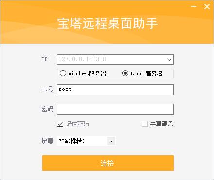
宝塔Linux系统挂载数据盘教程 Centos系统请使用以下命令:yum install wget -y && wget -O auto_disk.sh http://download.bt.cn/tools/auto_disk.sh && bash auto_disk.shUbuntu系统请使用以下命令:wget -O auto_disk.sh http://download.bt.cn/tools/auto_disk.sh && sudo bash auto_disk.shDebian系统请使用以下命令:wget -O auto_disk.sh http://download.bt.cn/tools/auto_disk.sh && bash auto_disk.sh一键连接服务器助手下载:https://v.nta6.com/usr/uploads/2021/04/3609761055.zip
-
-